Thursday 25 October 2012

Message & Delivery: Research


Brief: Produce designs for a set of three high impact posters that deliver a personal identified message delivered from your research into part one of this brief.

What statement/fact/question are you intending to communicate?
The power of social media and the internet as a tool for political 
What is the tone?
Political//informative//fairly formal
Who are your audience?
Users of social networking sites such as Twitter//Facebook: probably specifically students and younger generation.


Initial ideas: considering the relationship between social network sites (specifically Twitter) and political protests - e.g. Libya, Egypt, & the case of Pussy Riot. I'm finding it really difficult to get a message across and haven't really conducted as much research into the cases of Libya & Egypt where Twitter had a big impact on the revolutions. I think I might be overcomplicating things and still want to focus on Pussy Riot as a subject matter. I am going to simplify it down to a clear message which I feel passionate about - Free Pussy Riot, and linking this with the importance of freedom of speech.

Monday 22 October 2012

Thursday 18 October 2012

Illustrator Workshop 2

Using the blend tool
Creating outlines in type and editing using the anchor point conversion tool//direct selection

Making letterforms using pathfinder

Changing the width and stroke of lines

Monday 15 October 2012

Alphabet Soup: Partner Typeface//Week 2


Bebas vs. Franchise Bold
I think that Franchise Bold is too compact and possibly a bit too cartoon-like, which I don't think fits in with how I want to communicate Sarah. I am going to try working with Bebas but adding slight curves to the edges where possible to give it a softer look.

Creating the Final Typeface

I decided on four basic glyphs - ! ? . , - and two common glyphs - & @ - to use in the typeface. The ampersand in Franchise Bold is very different so I will base the design on the quite curved Bebas ampersand, however otherwise I will probably take more direction from the Franchise Bold more rounded glyphs. I have printed out two sheets of the entire alphabets in both typefaces to test out all my ideas on a small scale using Bebas as the main base before working onto the final A1 tracing paper.


Testing the different letterforms in the style using Bebas as a base. Some letters such as M & W required a lot of different tests before I reached a solution I was happy with. I think the glyphs worked suprisingly well although the @ sign was more difficult to achieve. I then worked on the layout of the typeface and putting all the final letterforms together on a small scale:

I scanned these in to have a copy of the letterforms before filling them in with pattern and block, and then worked into a photocopied version:

These are my final letterforms. I think adding the line and block to them works really well and makes them more bold with different elements in the effect I set out to achieve. I played around on Illustrator with size and layout of the typeface, which I will print out on A1 and then trace over.

Final Layout on A1
I increased the tracking between the letterforms and decreased the leading. The typeface is set in 230 pt and because it is in uppercase I have quite a uniform structured layout, and don't have to worry about ascenders and descenders. I will print the base out on A1 to trace over the letterforms on the tracing paper for the final design.


Tracing the lines of the letterforms before filling in

Filling in blocks before adding the lines
Final A1 Design

Name Badge
Deciding what media//style to make it in - I think I want to stick to a simple style in keeping with the typeface and handrawn in the style of HelloVon


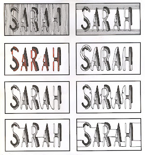
Considered using Sarah's favourite colours in the design and played around on Photoshop//Illustrator using Image Trace and different shapes. In the end I reverted back to a simple monochrome design because I think this most represents the design aesthetic that I wanted to go for.

Testing hand-drawn lines and connecting the letters in a similar style to the typeface

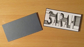
Final Design - connecting the letters with more lines after taking inspiration from HelloVon

Printed the design onto mountboard and then sellotaped a safety pin to the back - it's in a simple style in keeping with the typeface design.

Thursday 11 October 2012

Illustrator Workshop 1

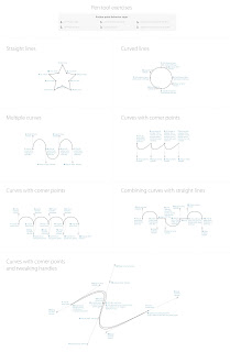
Pen tool excercises
Creating the vector letterform 'g' using layers//pen tool

Tuesday 9 October 2012

Alphabet Soup: Illustrator

Produce and alphabet based on one of the letterforms you created from Alphabet Soup: Visual Thinking
I think the N, K, Y & L work better than the A. The K works because of the nature of the tracing paper and I don't think would work as well digitally produced on Illustrator unless I changed the opacity  of individual lines which might prove to be complicated and not work as well as a series.

The N is very straightforward and could easily be constructed on Illustrator - perhaps too simple? The L has different elements but works well and would be quite straightforward to reproduce - similarly the Y is effective but more complex and don't know if it would sit well as an alphabet. Will try out both on a couple of different letterforms to see which works best.


These letters were all made using a combination of the pen tool and the 3D effect on the Bebas typeface. They all have their various intricacies about them - the K being the easiest because it is simply the 3D effect with a wireframe shading. It is less interesting than the hand-rendered version because of the lack of transparent tracing paper layers.

Although the N & O work well I anticipate some letters being really difficult to create because of using the pen tool. When lining them up with each other I could see they were different sizes and shapes and the alignment of a whole alphabet would be very difficult to execute professionally. My favourite letterform was always the Y and using the steps//blend tool I created evenly spaced Ys. I am going to work on developing this letter further as I think it could work really well as an alphabet.

I think this letterform works really well. It definitely still communicates the idea of 'layer' and is interesting & intricate because of the different elements, but definitely applicable to an entire alphabet.


Considering the use of colour - CMYK only but can experiment with opacity//half-tones.


I'm in two minds about if the colour versions are more effective or not. Although the opacity gives a nice effect I think it loses impact as a whole alphabet when in colour and doesn't stand out as much. I also like the swatch of horizontal lines used in the black and white version.

Even though for this brief we are just making an alphabet I experimented with a couple of glyphs to see how they would work, I think they would be just as effective.

I also tested my alphabet in context. Because of it's large width and layered nature it would definitely not be suitable for body copy but I think as a display type it works well and has quite an illustrative feel to it which definitely conveys the starting point of 'layer'.


Final A1 Print on White Stock