Bebas vs. Franchise Bold
I think that Franchise Bold is too compact and possibly a bit too cartoon-like, which I don't think fits in with how I want to communicate Sarah. I am going to try working with Bebas but adding slight curves to the edges where possible to give it a softer look.
Creating the Final Typeface
I decided on four basic glyphs - ! ? . , - and two common glyphs - & @ - to use in the typeface. The ampersand in Franchise Bold is very different so I will base the design on the quite curved Bebas ampersand, however otherwise I will probably take more direction from the Franchise Bold more rounded glyphs. I have printed out two sheets of the entire alphabets in both typefaces to test out all my ideas on a small scale using Bebas as the main base before working onto the final A1 tracing paper.
Testing the different letterforms in the style using Bebas as a base. Some letters such as M & W required a lot of different tests before I reached a solution I was happy with. I think the glyphs worked suprisingly well although the @ sign was more difficult to achieve. I then worked on the layout of the typeface and putting all the final letterforms together on a small scale:
I scanned these in to have a copy of the letterforms before filling them in with pattern and block, and then worked into a photocopied version:
These are my final letterforms. I think adding the line and block to them works really well and makes them more bold with different elements in the effect I set out to achieve. I played around on Illustrator with size and layout of the typeface, which I will print out on A1 and then trace over.
 |
| Final Layout on A1 |
 |
| Tracing the lines of the letterforms before filling in |
 |
| Filling in blocks before adding the lines |
 |
| Final A1 Design |
Name Badge
 |
| Deciding what media//style to make it in - I think I want to stick to a simple style in keeping with the typeface and handrawn in the style of HelloVon |
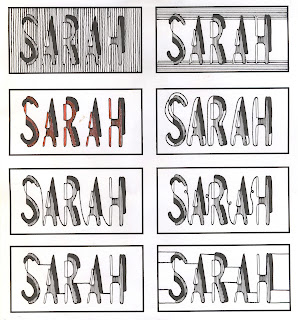
Considered using Sarah's favourite colours in the design and played around on Photoshop//Illustrator using Image Trace and different shapes. In the end I reverted back to a simple monochrome design because I think this most represents the design aesthetic that I wanted to go for.
Testing hand-drawn lines and connecting the letters in a similar style to the typeface
 |
| Final Design - connecting the letters with more lines after taking inspiration from HelloVon |
 |
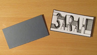
| Printed the design onto mountboard and then sellotaped a safety pin to the back - it's in a simple style in keeping with the typeface design. |


No comments:
Post a Comment