


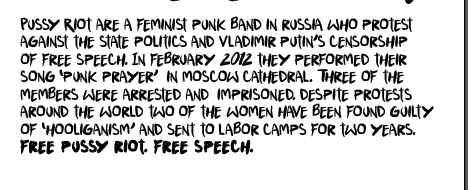
I do think losing the green lessens the impact and interest of the posters slightly. I also think the pink on pink in the middle poster doesn't work so well so might make the background black. Another point of feedback was the lack of information so I played around with adding a (concise as possible) chunk of text explaining about Pussy Riot:


I tried to experiment with different positioning of the text and changing the tracking and kerning also. I wanted to keep the main slogan part of the poster the same, as although it was incredibly simple I think it works in the riot guerilla-style slogan. I think the text unfortunately just completely takes away from the impact. I don't want to make the poster completely factual and blatant and overly-formal because protest propaganda is not made in that style. I decided to instead add a link to the official pussy riot website - http://freepussyriot.org. I also added this to the text and image poster, and reprinted the final results on antique white stock, which gave it a screen-print style finish.


 |
| Final posters on A3 Antique White stock |
No comments:
Post a Comment